
Here’s a little trick to make a super-basic Gantt Chart / timeline graph using Google Sheets.
Quick start: Basic Gantt Chart template.
Disclaimer: This is not a powerful management tool nor a replacement to timeline project software. This simply displays a spreadsheet chart in a Gantt-like style.
Prerequisites: Google account with access to Google Drive (AKA Google Docs) and a working knowledge of spreadsheets.
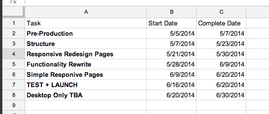
Create a new spreadsheet with three (3) columns — Add tasks with respective start and end dates.
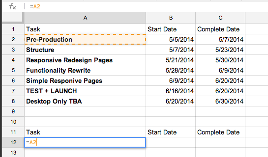
Copy & paste headers below your data — Add formula =A2 to copy first row/column of tasks.
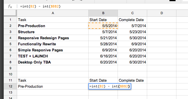
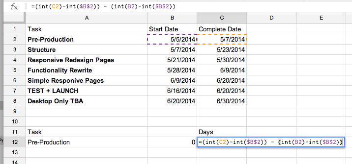
Convert dates to days with int() function — Subtract the constant Start Date days from self (and other days) to convert all dates into project days and task days.
=int(B2) - int($B$2)
NOTE: Using $B$2 will make the value static and always represent that cell, so when we paste into other columns, it will remain the start date cell value.
Find the number of days the task is projected to take by subtracting converted Start Date days from converted Complete Date days.
=( int(C2) - int($B$2) ) - ( int(B2) - int($B$2) )
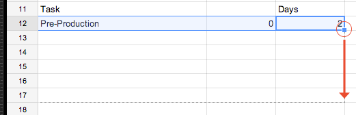
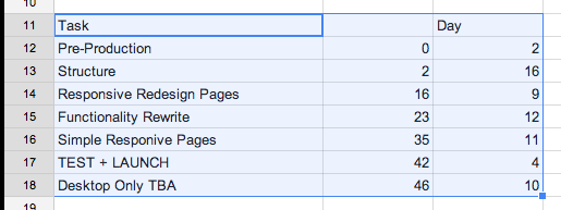
Copy the row by selecting the first three columns of data, then dragging the bottom right corner down 6 rows.
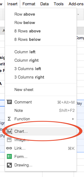
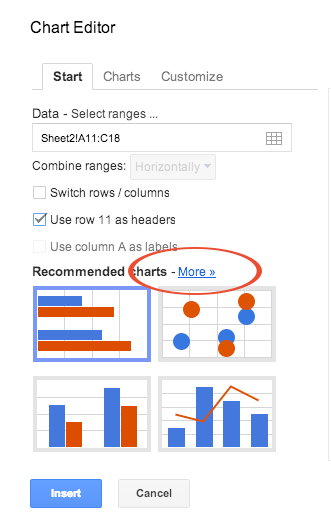
Select the data range then click “insert chart” icon or select menu item.
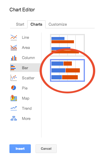
Select “Stacked Bar Chart” type by clicking “more.”
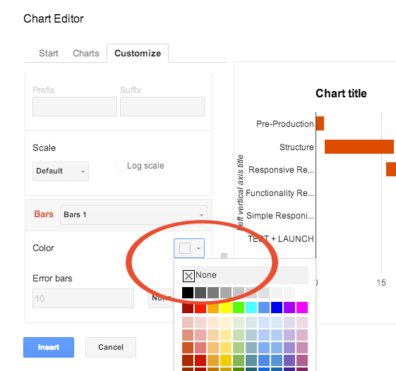
Finally, change the first bar set color to “none.”
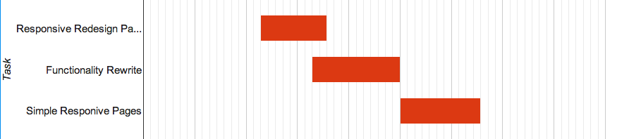
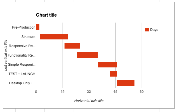
The chart now shows only the days a task will take. Edit title and axes as needed. Since we used formulas to create chart data, simply change dates next to tasks and the chart will update automatically.
Let me know if this tutorial was helpful. I’d love to hear how you’ve implemented or improved upon it. Try it: Basic Gantt Chart template.